|
|

Headings
To create a header, place "hn. " at the start of the line (where n can be a number from 1-6).
| Notation |
Comment |
| h1. Biggest heading |
Biggest heading
|
| h2. Bigger heading |
Bigger heading
|
| h3. Big Heading |
Big Heading
|
| h4. Normal Heading |
Normal Heading
|
| h5. Small Heading |
Small Heading
|
| h6. Smallest Heading |
Smallest Heading
|
Text Effects
Text effects are used to change the formatting of words and sentences.
| Notation |
Comment |
| *strong* |
Makes text strong.
|
| _emphasis_ |
Makes text emphasis.
|
| ??citation?? |
Makes text in citation.
|
| -strikethrough- |
Makes text as strikethrough.
|
| +underlined+ |
Makes text as underlined.
|
| ^superscript^ |
Makes text in superscript.
|
| ~subscript~ |
Makes text in subscript.
|
| {{text will be monospaced}} |
Makes text as code text.
|
| bq. Some block quoted text |
To make an entire paragraph into a block quotation, place "bq. " before it.
Example:
Some block quoted text
|
{quote}
here is quoteble
content to be quoted
{quote}
|
Quote a block of text that's longer than one paragraph.
Example: here is quotable
content to be quoted
|
{color:red}
look ma, red text!
{color}
|
Changes the color of a block of text.
Example:
look ma, red text!
|
Text Breaks
Most of the time, explicit paragraph breaks are not required - Confluence will be able to paginate your paragraphs properly.
| Notation |
Comment |
| (empty line) |
Produces a new paragraph |
| \\ |
Creates a line break. Not often needed, most of the time Confluence will guess new lines for you appropriately. |
| ---- |
Creates a horizontal rule |
| --- |
Produces — symbol. |
| -- |
Produces – symbol. |
Links
Links are the heart of Confluence, so learning how to create them quickly is important.
| Notation |
Comment |
[#anchor]
[^attachment.ext]
or
[pagetitle]
[pagetitle#anchor]
[pagetitle^attachment.ext]
or
[spacekey:pagetitle]
[spacekey:pagetitle#anchor]
[spacekey:pagetitle^attachment.ext]
|
Creates an internal hyperlink to the specified page in the desired space (or the current one if you don't specify any space). Appending the optional '#' sign followed by an anchor name will lead into a specific bookmarked point of the desired page. Also having the optional '^' followed by the name of an attachment will lead into a link to the attachment of the desired page.
Example:
pagetitle
If such a page doesn't already exist, it will allow you to create the page in the current space. Create page links will have a  after them. after them.
Example:
anewpage
|
[link alias|#anchor|link tip]
[link alias|^attachment.ext|link tip]
or
[link alias|pagetitle|link tip]
[link alias|pagetitle#anchor|link tip]
[link alias|pagetitle^attachment.ext|link tip]
or
[link alias|spacekey:pagetitle|link tip]
[link alias|spacekey:pagetitle#anchor|link tip]
[link alias|spacekey:pagetitle^attachment.ext|link tip]
|
Creates an internal hyperlink to the specified page in the desired space (or the current one if you don't specify any space) where the link text is different from the actual hyperlink link. Also you can have an optional link tip which will appear as tooltip. Appending the optional '#' sign followed by an anchor name will lead into a specific bookmarked point of the desired page. Also having the optional '^' followed by the name of an attachment will lead into a link to the attachment of the desired page.
Example:
link alias
|
|
[/2004/01/12/Blog Post]
[spacekey:/2004/01/12/Blog Post]
|
Creates an internal hyperlink to the specified blog post in the desired space (or the current one if you don't specify any space). You must specify the date the post was made in /year/month/day form as shown. Anchors and link text can be added the same way as described above. If you attempt to link to a blog post that doesn't exist, no link will be created.
Example:
|
[/2004/01/12]
[spacekey:/2004/01/12]
or
[my link name|/2004/01/12]
[my link name|spacekey:/2004/01/12]
|
Creates an internal hyperlink to a view of a whole day's blog. Specify the date you wish to link to as year/month/day. Link titles can be supplied as with other links. It is possible to link to days with no blog posts on them: the destination page will just be empty.
Examples:
|
[$12345]
or
[my link name|$12345]
|
Creates a link to a piece of content by its internal database ID. This is currently the only way to link to a mail message.
Examples:
|
[spacekey:]
[custom link title|spacekey:]
|
Creates a link to the space homepage, or space summary page of a particular space. Which of these the link points to depends on the configuration of the space being linked to. If the space does not exist, the link will be drawn with a strike-through to indicate it is an invalid space.
Examples:
|
[~username]
[custom link title|~username]
|
Creates a link to the user profile page of a particular user. By default, will be drawn with a user icon and the user's full name, but if you supply a custom link text, the icon will not be drawn. If the user being linked to does not exist, the link will be drawn with a strike-through.
Examples:
|
[phrase@shortcut]
[custom link text|phrase@shortcut] |
Creates a shortcut link to the specified shortcut site. Shortcuts are configured by the site administrator. You can add a link title to shortcuts in the same manner as other links.
Examples:
|
[http://confluence.atlassian.com]
[Atlassian|http://atlassian.com] |
Creates a link to an external resource, special characters that come after the URL and are not part of it must be separated with a space. External links are denoted with an arrow icon.
Note: the [] around external links are optional in the case you do not want to use any alias for the link.
Examples:
|
| [mailto:legendaryservice@atlassian.com] |
Creates a link to an email address, complete with mail icon.
Example:
 legendaryservice@atlassian.com legendaryservice@atlassian.com
|
[file://c:/temp/foo.txt]
[file://z:/file/on/network/share.txt] |
This only works on Internet Explorer
Creates a link to file on your computer or on a network share that you have mapped to a drive
|
|
{doc:/display/DOC/Confluence+Documentation+Home}Confluence Documentation{doc}
|
A macro that allows you to quickly create links to content at http://confluence.atlassian.com.
|
|
{anchor:anchorname}
|
Creates a bookmark anchor inside the page. You can then create links directly to that anchor. So the link [My Page#here] will link to wherever in "My Page" there is an {anchor:here} macro, and the link [#there] will link to wherever in the current page there is an {anchor:there} macro.
|
Lists
Lists allow you to present information as a series of ordered items.
| Notation |
Comment |
* some
* bullet
** indented
** bullets
* points
|
A bulleted list (must be in first column). Use more (**) for deeper indentations.
Example:
|
- different
- bullet
- types
|
A list item (with -), several lines create a single list.
Example:
|
# a
# numbered
# list
|
A numbered list (must be in first column). Use more (##, ###) for deeper indentations.
Example:
- a
- numbered
- list
|
|
# a
# numbered
#* with
#* nested
#* bullet
# list * a
* bulletted
*# with
*# nested
*# numbered
* list
|
You can even go with any kind of mixed nested lists:
Example:
- a
- numbered
- list
- a
- bulletted
- with
- nested
- numbered
- list
|
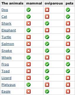
{checklist:name=The animals| parent=Animals|checklabels=mammal, oviparous, pets}
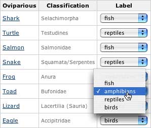
{checklist:name=Oviparious|parent=Animals|excerpt-heading=Classification|label=oviparous|checklabels=fish, amphibians, reptiles, birds|mutuallyexclusive=true}
{checklist:name=The pets| parent=demo:Animals| label=pets| excerpt-heading=Classification| comment-heading=Comments}
|
Generates a checklist for a subset of pages. The rows are children pages of a given page (parent)
and can be filtered by a label. The columns can be labels that are set/un-set for the pages, the
excerpt or a text.
The columns of the checklist can also be defined using the {checklist-label}, {checklist-input},
{checklist-wikiinput}, {checklist-select}, {checklist-excerpt},
{checklist-include}, {checklist-wiki}, {checklist-metadata} macros.
Generates a checklist for a subset of pages. The rows are children pages of a given page (parent) and can be
filtered by a label.
The columns can be labels that are set/un-set for the pages, the excerpt or a text. You can set/unset the tag
in the row pages and edit the text.
Parameters value can have any of the following keywords that will be replace when rendering the page:
| Keyword |
Value |
| @user@ |
current user's name |
| @userfullname@ |
current user's full name |
| @self@ or title |
the title of the page owning the checklist |
| @creator@ |
the page creator's user name |
| @modifier@ |
the last modifier's user name |
| @any other value name@ |
the given metadata value in the page owning the checklist |
| parameter |
Mandatory? |
Default |
description |
name or unnamed
first parameter |
no |
current page's name |
the name of the checklist |
| parent |
no |
|
the parent page, if not set, and there is no label set either, then the page containing the checklist will be used as such |
| label |
no |
|
the label the selected must have |
| space |
no |
|
the space to reduce the query to, when using label only and no parent |
| depth |
no |
0 |
depth of the search for children ('0' for no limit) |
| childrenonly |
no |
false |
whether or not parent-children are to be included |
| sort |
no |
name |
How the table should be sorted: name to sort by name, created to sort by page creation date, or modified to sort by last modification date |
| checklabels |
no |
|
a comma separated list of labels to be used to 'check' the pages |
| mutuallyexclusive |
no |
false |
whether or not the checklabels are mutually exclusive |
| excerpt-heading |
no |
|
the heading for the excerpt column |
| comment |
no |
|
the heading for a column to be used for comments |
| class |
no |
grid |
the style sheet (CSS) class to use for the table |
| pagelink |
no |
true |
whether or not to include a link to the pages as the first column of the table |
Examples
Lets say we have a page Animals as parent of the pages Dog, Cat,
Shark, Elephant, Turtle, Salmon, Snake,
Whale, Frog, Toad, Lizard, Platypus and
Eagle.
In the first example, all the children of Animals are shown. The checks are for the labels
mammal, oviparous and pets. Whenever any the check is selected, the appropriate
label is added/removed to/from the page on the row.
In the second example, the excerpt of each page is shown, and it will show only the children
of Animals that have the label oviparous and the check labels
bird, fish, amphibian and reptile are mutually exclusive.
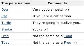
In the third example, only the children of Animals that have the label pets are shown.
The excerpt of each page is shown and a comment can be added to each page in the checklist
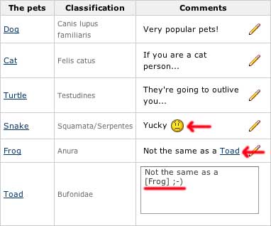
Note how the comment text can be actual wiki content.
|
|
{checklist-label:Mammal?|label=mammal}
|
When used within a {checklist} macro, it defines a column as a label check. Every time a
cell of this column is selected, the label will be added/removed to/from the referred page
| parameter |
Mandatory? |
Default |
description |
heading or unnamed
first parameter |
yes |
|
The heading of the column |
| label |
no |
the heading |
The label to be used to 'check' the pages |
| width |
no |
|
width of the column |
| class |
no |
|
the style sheet (CSS) class to use for the cells |
| readonly |
no |
false |
whether or not the column is read-only |
Example
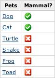
{checklist:name=Pets|parent=Animals|label=pets}
   {checklist-label:Mammal?|label=mammal}
{checklist}
|
|
{checklist-input:Common pet names|cols=20}
|
When used within a {checklist} macro, it defines a column as a text input.
| parameter |
Mandatory? |
Default |
description |
heading or unnamed
first parameter |
yes |
|
The heading of the column |
| cols |
yes |
|
The maximum number of characters read |
| width |
no |
|
width of the column |
| class |
no |
|
the style sheet (CSS) class to use for the cells |
| readonly |
no |
false |
whether or not the column is read-only |
| sorttype |
no |
S |
Type of value to be used to sort the table by this column. Values could be any of A, C, D, F, I, S, as defined in the Table Plugin |
| store |
no |
rows |
Determines where to store the value. Use rows to store the values for this column into the pages representing each row (metadata value name is <Column Heading>), or checklist to store the values into the page containing the checklist (metadata value name is <Column Heading>.<Row page title>) |
Example
{checklist:name=Pets names|parent=Animals|label=pets}
   {checklist-input:Common pet names|cols=20}
{checklist}
|
|
{checklist-wikiinput:Comments| rows=5| cols=20| width=90%}
|
When used within a {checklist} macro, it defines a column as a wiki-text input.
| parameter |
Mandatory? |
Default |
description |
heading or unnamed
first parameter |
yes |
|
The heading of the column |
| cols |
yes |
|
The number of columns in the text area when editing the value |
| rows |
no |
1 |
The number of rows in the text area when editing the value |
| width |
no |
|
width of the column |
| class |
no |
|
the style sheet (CSS) class to use for the cells |
| readonly |
no |
false |
whether or not the column is read-only |
| sorttype |
no |
S |
Type of value to be used to sort the table by this column. Values could be any of A, C, D, F, I, S, as defined in the Table Plugin |
| store |
no |
rows |
Determines where to store the value. Use rows to store the values for this column into the pages representing each row (metadata value name is <Column Heading>), or checklist to store the values into the page containing the checklist (metadata value name is <Column Heading>.<Row page title>) |
Example
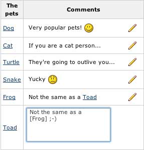
{checklist:name=The pets| parent=Animals| label=pets}
    {checklist-wikiinput:Comments|rows=5|cols=20|width=90%}
{checklist}
|
{checklist-select:Can swim?}
yes
no
{checklist-select}
{checklist-select:Type|uselabels=true}
fish|It's a fish
amphibians|It's an amphibian
reptiles|It's a reptile
birds|It's a bird
{checklist-select}
{checklist-select:Who owns one?|usersgroup=all}
|
When used within a {checklist} macro, it defines a column as a selection (drop-down menu).
The selection can be from a list of options, a list of labels or a list of users.
| parameter |
Mandatory? |
Default |
description |
heading or unnamed
first parameter |
yes |
|
The heading of the column |
| uselabels |
no |
false |
instead of setting a metadata value, add the selected label |
| usersgroup |
no |
|
instead of listing the value, use the given users group to select from a list of users. Use all for listing all the users |
| width |
no |
|
width of the column |
| class |
no |
|
the style sheet (CSS) class to use for the cells |
| readonly |
no |
false |
whether or not the column is read-only |
| sorttype |
no |
S |
Type of value to be used to sort the table by this column. Values could be any of A, C, D, F, I, S, as defined in the Table Plugin |
| store |
no |
rows |
Determines where to store the value. Use rows to store the values for this column into the pages representing each row (metadata value name is <Column Heading>), or checklist to store the values into the page containing the checklist (metadata value name is <Column Heading>.<Row page title>) |
| macro body |
|
|
If no usersgroup is given, the options to select from have to be defined as part of the body.
Each line of the body define an option. Each option could have a different value from the actual caption by defining it
as <value>|<caption> |
If store is set to checklist and there is only one option to select from, then the column is handled as a checkbox.
Examples
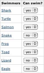
{checklist:name=Swimmers|parent=Animals|label=oviparous}
   {checklist-select:Can swim?}
      yes
      no
   {checklist-select}
{checklist}
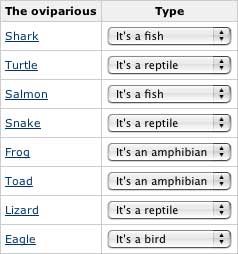
{checklist:name=The oviparious|parent=Animals|label=oviparous}
   {checklist-select:Type|uselabels=true}
       fish|It's a fish
       amphibians|It's an amphibian
       reptiles|It's a reptile
       birds|It's a bird
   {checklist-select}
{checklist}
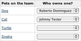
{checklist:name=Pets on the team|parent=Animals|label=pets}
   {checklist-select:Who owns one?|usersgroup=all}
{checklist}
|
{checklist-wiki:Photo}
!photo.jpg!
{checklist-wiki}
|
When used within a {checklist} macro, it defines a column as a wiki segment to be
rendered for each of the pages on the checklist.
| parameter |
Mandatory? |
Default |
description |
heading or unnamed
first parameter |
yes |
|
The heading of the column and the metadata value name |
| width |
no |
|
width of the column |
| class |
no |
|
the style sheet (CSS) class to use for the cells |
| sorttype |
no |
S |
Type of value to be used to sort the table by this column. Values could be any of A, C, D, F, I, S, as defined in the Table Plugin |
| macro body |
|
|
the wiki segment to be rendered for each page on the checklist |
Example
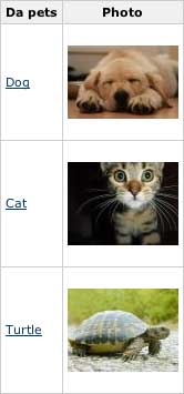
Assuming each of the pages contains an attachment photo.jpg
{checklist:name=Da pets|parent=Animals|label= pets}
   {checklist-wiki:Photo}
       !photo.jpg!
   {checklist-wiki}
{checklist}
|
|
{checklist-excerpt:Classification|width=10%}
|
When used within a {checklist} macro, it defines a column as the excerpt of each of the pages.
| parameter |
Mandatory? |
Default |
description |
heading or unnamed
first parameter |
yes |
|
The heading of the column |
| width |
no |
|
width of the column |
| class |
no |
|
the style sheet (CSS) class to use for the cells |
| sorttype |
no |
S |
Type of value to be used to sort the table by this column. Values could be any of A, C, D, F, I, S, as defined in the Table Plugin |
Example
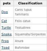
{checklist:name=pets| parent=Animals| label=pets}
    {checklist-excerpt:Classification|width=10%}
{checklist}
|
|
{checklist-pagelink:Edit|destination=view|width=10%}
|
When used within a {checklist} macro, it defines a column as a link to each of the pages.
| parameter |
Mandatory? |
Default |
description |
heading or unnamed
first parameter |
yes |
|
The heading of the column |
| destination |
no |
view |
the link should go to (view or edit) |
| width |
no |
|
width of the column |
| class |
no |
|
the style sheet (CSS) class to use for the cells |
| sorttype |
no |
S |
Type of value to be used to sort the table by this column. Values could be any of A, C, D, F, I, S, as defined in the Table Plugin |
|
|
{checklist-include:Full page}
|
When used within a {checklist} macro, it defines a column as the entire content of
each of the pages.Use with caution, it can get really messy.
| parameter |
Mandatory? |
Default |
description |
heading or unnamed
first parameter |
yes |
|
The heading of the column |
| width |
no |
|
width of the column |
| class |
no |
|
the style sheet (CSS) class to use for the cells |
| sorttype |
no |
S |
Type of value to be used to sort the table by this column. Values could be any of A, C, D, F, I, S, as defined in the Table Plugin |
Example
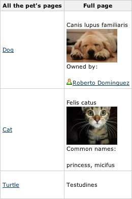
{checklist:name=All the pet's pages|parent=Animals|label= pets}
   {checklist-include:Full page}
{checklist}
|
{checklist-metadata:Comments}
|
When used within a {checklist} macro, it defines a column as a lookup of existing
metadata for each page.
| parameter |
Mandatory? |
Default |
description |
heading or unnamed
first parameter |
yes |
|
The heading of the column and the metadata value name |
| width |
no |
|
width of the column |
| class |
no |
|
the style sheet (CSS) class to use for the cells |
| sorttype |
no |
S |
Type of value to be used to sort the table by this column. Values could be any of A, C, D, F, I, S, as defined in the Table Plugin |
Example
{checklist:name=The pets names|parent=Animals|label=pets}
   {checklist-metadata:Comments}
{checklist}
|
{checklist-attribute:attribute=Common pet names}
{checklist-attribute:page=confluence:Cat| attribute=Comments}
|
Displays the value of an attribute set on a page through a {checklist}
| parameter |
description |
| page |
(optional) title of the page to lookup. If none set, then the current page will be used |
| attribute |
Name of the attribute (column) set in the checklist |
The first example on the side will display fido, dino... if the segment is in the Dog page
The second example on the side will display If you are a cat person... from any page
|
|
{checklist-log:format=useranddate| maxentries=1|Comments}
|
Generates a checklist change report for a given page.
| parameter |
Mandatory? |
Default |
description |
| page |
no |
current page |
The title of the page to generate the report from |
| maxentries |
no |
0 (no limit) |
The maximum number of entries to report (0 for no limit) |
| maxentriespername |
no |
0 (no limit) |
The maximum number of entries per value name (0 for no limit) |
| mostrecentfirst |
no |
false |
whether or not display the most recent entry first |
| format |
no |
detailed |
Defines the way each of log entries is to be reported:
date : display only the date
dateanduser: display the date and use
detailed: display all the available information
newvalue: display only the new value
oldvalue: display only the last value
simple: display date, user and new value in a single line
user: display only the user
useranddate: display the user and date |
remaining
unnamed parameters |
no |
|
each remaining unnamed parameters in the macro indicate what name values are to be included in the report. If none set, the report will include all the value names |
Example
{checklist-log:format=useranddate|maxentries=1|Comments}

|
{checklist-column:heading=Classification| type=excerpt| width=5%}
{checklist-column:heading=Mammal| type=label| label=mammal}
{checklist-column:heading=Comments| type=text| cols=30| readonly=true}
{checklist-column:heading=Common pet names| type=text| rows=5| cols=20}
|
This macro is being deprecated. Use {checklist-label}, {checklist-excerpt} or
{checklist-wikiinput} instead.
Defines more detailed column information for a {checklist}.
| parameter |
Mandatory? |
Default |
description |
| heading |
yes |
|
Heading of the column |
| type |
yes |
|
type of column. It can be any of label, text or excerpt |
| label |
yes, if
type=label |
|
the label to be used to 'check' the pages |
| rows |
yes, if
type=text |
|
rows when editing text area |
| cols |
yes, if
type=text |
|
cols when editing text area |
| width |
no |
|
width of the of column |
| readonly |
no |
false |
whether or not the column is read-only |
Note that the {checklist-column} macro must be contained within a {checklist} macro.
|
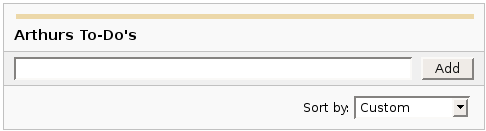
{dynamictasklist:thingsToDo}
{dynamictasklist:thingsToDo|showAssignee=false}
{dynamictasklist:thingsToDo|promptOnDelete=false}
|
The Dynamic Tasklist Macro displays a task list which can be modified in the page as it is viewed. Despite the fact that this plugin has an ajax UI, it is still fully versioned like a normal Confluence page.
- showAssignee - (optional) If set to true the assignee will be shown in the tasks.
- width - (optional) The width of the tasklist (default is 640px). To set the width to 400 pixels, set the parameter value to 400px.
- enableLocking - (optional) If set to true, tasks can be locked so other users can not modify.
- autoLockOnComplete (optional) Used in conjunction with enableLocking. Tasks will auto lock when it is completed.
- promptOnDelete - (optional) If set to false there will not be any confirmation prompt when deleting a task.
Example:
| What you need to type |
What you will get |
| {dynamictasklist:Arthurs To-Do's} |
|
|
Images
Images can be embedded into Confluence pages from attached files or remote sources.
| Notation |
Comment |
!http://www.host.com/image.gif!
or
!attached-image.gif!
|
Inserts an image into the page. If a fully qualified URL is given the image will be displayed from the remote source, otherwise an attached image file is displayed.
|
!spaceKey:pageTitle^image.gif!
!/2007/05/23/My Blog Post^image.gif!
|
Inserts an image that is attached on another page or blog post. If no space key is defined, the current is space is used by default.
|
| !image.jpg|thumbnail! |
Insert a thumbnail of the image into the page (only works with images that are attached to the page). Users can click on the thumbnail to see the full-sized image. Thumbnails must be enabled by the site administrator for this to work.
|
| !image.gif|align=right, vspace=4! |
For any image, you can also specify attributes of the image tag as a comma separated list of name=value pairs like so.
|
{gallery}
{gallery:columns=3}
{gallery:title=Some office photos, and a waterfall|columns=3}
{gallery:title=Some office photos, without the waterfall|exclude=waterfall.jpg}
{gallery:title=One office photo, and a waterfall|include=office1.jpg,waterfall.jpg}
{gallery:title=Some office photos, and a waterfall|page=Gallery of Pictures}
{gallery:title=Some office photos, and a waterfall|page=DOC:Gallery of Pictures}
{gallery:title=Some office photos, and a waterfall|sort=name}
{gallery:title=Some office photos, and a waterfall|sort=date|reverse=true}
|
Create a gallery of thumbnails of all images attached to a page. This will only work on pagesthat allow attachments, obviously. The title parameter allows you to supply a title for the gallery The columns parameter allows you to specify the number of columns in the gallery (by default, 4) The exclude parameter allows you to specify the name of attached images to ignore (i.e., they will not be included in the gallery). You can specify more than one picture, separated by commas. Example: exclude=my picture.png,my picture2.gif The include parameter allows you to specifically include one or more attached images. The gallery will show only those pictures. You can specify more than one picture, separated by commas. Example: include=my picture.png,my picture2.gif The page parameter allows you specify the title of one or more pages which contains the images you want displayed. If a page is in the same space as the page containing the macro, use the format page=My Page Name. To specify a page in a different space, use page=SPACEKEY:My Page Name, such as page=DOC:Gallery Macro. You can specify more than one page, separated by commas. Example: page=Image Gallery,STAFF:Group Photos If a page or attachment file name contains a comma, you can use it in the include, exclude, or page parameters by enclosing it in single or doublequotes. Example: include="this,that.jpg",theother.png The sort parameter allows you to control the order of the images. The options are name,comment, date, or size. The reverse parameter is used in conjunction with the sort parameter to reverse the order of the specified sort. Valid values are true and false. Previous versions of the Gallery macro had an additional slideshow parameter. This is no longer used in the latest version, and the slide show is always enabled. We have left the parameter here for compatibility with older versions of the macro.
|
Tables
Tables allow you to organise content in a rows and columns, with a header row if required.
Advanced Formatting
More advanced text formatting.
| Notation |
Comment |
{code:title=Bar.java|borderStyle=solid}
// Some comments here
public String getFoo()
{
  return foo;
}
{code}
{code:xml}
<test>
    <another tag="attribute"/>
</test>
{code}
|
Makes a pre-formatted block of code with syntax highlighting. All the optional parameters of {panel} macro are valid for {code} too. The default language is Java but you can specify JavaScript, ActionScript, XML, HTML and SQL too.
Example:
public String getFoo()
{
return foo;
}
<test>
<another tag="attribute"/>
</test>
|
{chart:title=Fish Sold}
|| Fish Type || 2004 || 2005 ||
|| Herring | 9,500 | 8,300 |
|| Salmon | 2,900 | 4,200 |
|| Tuna | 1,500 | 1,500 |
{chart}
{chart:type=line|title=Temperatures in Brisbane|yLabel=Celcius
|dataDisplay=true|dataOrientation=vertical}
|| Month || Min || Max ||
| January | 31.3 | 37.5 |
| February | 26.8 | 32.7 |
| March | 25.1 | 28 |
| April | 18.7 | 25.3 |
{chart}
{chart:type=timeSeries|dateFormat=MM.yyyy|timePeriod=Month|
dataOrientation=vertical|rangeAxisLowerBound=0|colors=blue,gray}
|| Month || Revenue ||
| 1.2005 | 31.8 |
| 2.2005 | 41.8 |
| 3.2005 | 51.3 |
| 4.2005 | 33.8 |
| 5.2005 | 27.6 |
| 6.2005 | 49.8 |
| 7.2005 | 51.8 |
| 8.2005 | 77.3 |
| 9.2005 | 73.8 |
| 10.2005 | 97.6 |
| 11.2005 | 101.2 |
| 12.2005 | 113.7 |
|| Month || Expenses ||
| 1.2005 | 41.1 |
| 2.2005 | 43.8 |
| 3.2005 | 45.3 |
| 4.2005 | 45.0 |
| 5.2005 | 44.6 |
| 6.2005 | 43.8 |
| 7.2005 | 51.8 |
| 8.2005 | 52.3 |
| 9.2005 | 53.8 |
| 10.2005 | 55.6 |
| 11.2005 | 61.2 |
| 12.2005 | 63.7 |
{chart}
|
Displays a chart using data from the supplied table or tables.
- Chart type parameters - These parameters change what type of chart to display and the way the chart looks.
- Display control parameters
- width - The width of the chart in pixels (default is '300')
- height - The height of the chart in pixels (default is '300')
- dataDisplay - Default is false to not display the rendered body of the macro (usually the data tables). When dataDisplay=true or dataDisplay=after, the data will be displayed after the chart. When dataDisplay=before, the data will be displayed before the chart.
- imageFormat - Default is png. Format of generated image. Valid formats are png and jpg. Other formats may be also be valid if installed on your server.
- Title and label customization parameters
- title - The title of the chart.
- subTitle - A subtitle for the chart using a smaller font.
- xLabel - The label to use for the x (domain) axis
- yLabel - The label to use for the y (range) axis
- legend - A legend will be displayed unless legend=false is specified.
- Data specification parameters - The data for the chart is taken from tables found when the macro body is rendered. These options control how this data is interpreted. By default, numeric and date values are interpreted according to the Confluence global default language (locale) formats. If conversion fails, other languages defined to Confluence will be tried. Additional conversion options can be specified using the parameters below.
- tables - Comma separated list of table ids and/or table numbers contained within the body of the macro that will be used as the data for the chart. Defaults to all first level tables. If data tables are embedded in other tables, then table selection will be required. This occurs when more complex formatting is done (for example using section and column macros).
- columns - Comma separated list of column labels and/or column titles and/or column numbers for tables used for chart data. This applies to all tables processed. Defaults to all columns. Columns are enumerated starting at 1. Column label is the text for the column in the header row. Column title is the (html) title attribute for the column in the header row.
- dataOrientation - The data tables will be interpreted as columns (horizontally) representing domain and x values unless 'dataOrientation=vertical'.
- timeSeries - If 'true', the x values in an XY plot will be treated as time series data and so will be converted according date formats.
- dateFormat - For time series data, the date format allows for additional customization of the conversion of data to date values. By default, the Confluence language defined date formats will be used. If a dateFormat is specified, it will be the first format used to interpret date values. Specify a format that matches the format of the time series data. See Date Format.
- timePeriod - Specify the time period for time series data. Default is 'Day'. This defines the granularity of how the data is interpreted. Valid values are: Day, Hour, Millisecond, Minute, Month, Quarter, Second, Week, Year.
- language - If provided, the language and country specification will be used to create additional number and date formats to be used for data conversion. This specification will be used before the default languages automatically used. Valid values are 2 character ISO 639-1 alpha-2 codes.
- country - Used in combination with the language parameter. Valid values are 2 character ISO 3166 codes.
- forgive - Default is true to try to convert numeric and date values that do not totally match any of the default or user specified formats. Specify forgive=false to enforce strict data format. Data format errors will cause the chart to not be produced.
- Color customization parameters - See Colors for how to specify colors.
- bgColor - Color (default is 'white') to use as the background of the chart.
- borderColor - Color of a border around the chart. Default is to not show a border.
- colors - Comma separated list of colors used to customize category, sections, and series colors.
- Axis customization parameters - Depending on the chart type, the range and domain axis may be customized. These values are automatically generated based on the data but can be overridden by specifying one or more more of these paramters.
- rangeAxisLowerBound - range axis lower bound
- rangeAxisUpperBound - range axis upper bound
- rangeAxisTickUnit - range axis units between axis tick marks
- rangeAxisLabelAngle - angle for the range axis label in degrees
- domainAxisLowerBound - domain axis lower bound. For a date axis, this value must be expressed in the date format specified by the dateFormat parameter. (Only used in XY Plots, standard charts will have no effect)
- domainAxisUpperBound - domain axis upper bound. For a date axis, this value must be expressed in the date format specified by the dateFormat parameter. (Only used in XY Plots, standard charts will have no effect)
- domainAxisTickUnit - domain axis units between axis tick marks. For a date axis, this value represents a count of the units specified in the timePeriod parameter. The time period unit can be overridden by specifying a trailing character: y for years, M for months, d for days, h for hours, m for minutes, s for seconds, u - milliseconds. (Only used in XY Plots, standard charts will have no effect)
- domainAxisLabelAngle - angle for the domain axis label in degrees. (Only used in XY Plots, standard charts will have no effect)
- categoryLabelPosition - allows axis label text position for categories to be customized
- up45 - 45 degrees going upward
- up90 - 90 degrees going upward
- down45 - 45 degrees going downward
- down90 - 90 degrees going downward
- dateTickMarkPosition - placement of the date tick mark
- start (default) - tick mark is at the start of the date period
- middle - tick mark is in the middle of the date period
- end - tick mark is at the end of the date period
- Pie chart customization parameters
- pieSectionLabel - Format for how pie section labels are displayed. :
- %0% is replaced by the pie section key.
- %1% is replaced by the pie section numeric value.
- %2% is replaced by the pie section percent value.
Example 1: "%0% = %1%" would display something like "Independent = 20"
Example 2: "%0% (%2%)" would display something like "Independent (20%)"
- pieSectionExplode - Comma separated list of pie keys that are to be shown exploded. Defaults to no exploded sections. Note: requires jFreeChart version 1.0.3 or higher.
- Attachment parameters - These are advanced options that can be used for chart versioning, automation enablement, and to improve performance. Use these options carefully! Normally, the chart image is regenerated each time the page is displayed. These options allow for the generated image to be saved as an attachment and have subsequent access re-use the attachment. This can be useful especially when combined with the cache macro to improve performance. Depending on the options chosen, chart images can be versioned for historical purposes.
- attachment - Chart image will be saved in a attachment.
- ^attachment - chart.macro.param.attachment.attachment
- page^attachment - The chart is saved as an attachment to the page name provided.
- space:page^attachment - The chart is saved as an attachment to the page name provided in the space indicated.
- attachmentVersion - Defines the the versioning mechanism for saved charts.
- new - (default) Creates new version of the attachment.
- replace - Replaces all previous versions of the chart. To replace an existing attachment, the user must be authorized to remove attachments for the page specified.
- keep - Only saves a new attachment if an existing export of the same name does not exist. An existing attachment will not be changed or updated.
- attachmentComment - Comment used for a saved chart attachment.
- thumbnail - Default is false. If true, the chart image attachment will be shown as a thumbnail.
Colors can be specified by name or hex value. See Web-colors. The following are the valid color names that will automatically be converted.
| Color |
Hexadecimal |
Color |
Hexadecimal |
Color |
Hexadecimal |
Color |
Hexadecimal |
| black |
#000000 |
silver |
#c0c0c0 |
maroon |
#800000 |
red |
#ff0000 |
| navy |
#000080 |
blue |
#0000ff |
purple |
#800080 |
fuchsia |
#ff00ff |
| green |
#008000 |
lime |
#00ff00 |
olive |
#808000 |
yellow |
#ffff00 |
| teal |
#008080 |
aqua |
#00ffff |
gray |
#808080 |
white |
#ffffff |
Copied from Java SimpleDateFormat specification.
Date and time formats are specified by date and time pattern strings. Within date and time pattern strings, unquoted letters from 'A' to 'Z' and from 'a' to 'z' are interpreted as pattern letters representing the components of a date or time string. Text can be quoted using single quotes (') to avoid interpretation. "'" represents a single quote. All other characters are not interpreted; theyre simply copied into the output string during formatting or matched against the input string during parsing.
The following pattern letters are defined (all other characters from 'A' to 'Z' and from 'a' to 'z' are reserved):
Pattern letters are usually repeated, as their number determines the exact presentation.
- Text:
For formatting, if the number of pattern letters is 4 or more, the full form is used; otherwise a short or abbreviated form is used if available. For parsing, both forms are accepted, independent of the number of pattern letters.
- Number:
For formatting, the number of pattern letters is the minimum number of digits, and shorter numbers are zero-padded to this amount. For parsing, the number of pattern letters is ignored unless its needed to separate two adjacent fields.
- Year:
For formatting, if the number of pattern letters is 2, the year is truncated to 2 digits; otherwise it is interpreted as a number.
For parsing, if the number of pattern letters is more than 2, the year is interpreted literally, regardless of the number of digits. So using the pattern "MM/dd/yyyy", "01/11/12" parses to Jan 11, 12 A.D. For parsing with the abbreviated year pattern ("y" or "yy"), SimpleDateFormat must interpret the abbreviated year relative to some century. It does this by adjusting dates to be within 80 years before and 20 years after the time the SimpleDateFormat instance is created. For example, using a pattern of "MM/dd/yy" and a SimpleDateFormat instance created on Jan 1, 1997, the string "01/11/12" would be interpreted as Jan 11, 2012 while the string "05/04/64" would be interpreted as May 4, 1964. During parsing, only strings consisting of exactly two digits, will be parsed into the default century. Any other numeric string, such as a one digit string, a three or more digit string, or a two digit string that isnt all digits (for example, "-1"), is interpreted literally. So "01/02/3" or "01/02/003" are parsed, using the same pattern, as Jan 2, 3 AD. Likewise, "01/02/-3" is parsed as Jan 2, 4 BC.
- Month:
If the number of pattern letters is 3 or more, the month is interpreted as text; otherwise, it is interpreted as a number.
- General time zone:
Time zones are interpreted as text if they have names. For time zones representing a GMT offset value, the following syntax is used:
     GMTOffsetTimeZone:
             GMT Sign Hours : Minutes

     Sign: one of
             + -
     Hours:
             Digit
             Digit Digit

     Minutes:
             Digit Digit
     Digit: one of
             0 1 2 3 4 5 6 7 8 9
Hours must be between 0 and 23, and Minutes must be between 00 and 59. The format is locale independent and digits must be taken from the Basic Latin block of the Unicode standard. For parsing, RFC 822 time zones are also accepted.
- RFC 822 time zone:
For formatting, the RFC 822 4-digit time zone format is used:
     RFC822TimeZone:
             Sign TwoDigitHours Minutes
     TwoDigitHours:
             Digit Digit
TwoDigitHours must be between 00 and 23. Other definitions are as for general time zones. For parsing, general time zones are also accepted.
|
{widget:url=http://au.youtube.com/watch?v=cOE8ukQoz6E}
{widget:url=http://au.youtube.com/watch?v=cOE8ukQoz6E | width=500 | height=400}
|
Widget Connector
|
|
{content-by-user:fred}
|
Displays a simple table of all the content (pages, comments, blog posts, user profiles and space descriptions) created by a user (here 'fred').
|
|
{index}
|
Displays an index of all the pages in the current space, cross linked and sorted alphabetically.
|
{include:Home}
{include:FOO:Home}
{include:spaceKey=FOO|pageTitle=Home}
|
Includes one page within another (this example includes a page called "Home"). Pages from another space can be included by prefacing the page title with a space key and a colon.
The user viewing the page must have permission to view the page being included, or it will not be displayed.
|
{note:title=Be Careful}
The body of the note here..
{note}
|
Prints a simple note to the user.
- title: - (optional) the title of the note.
- icon: - (optional) if "false", dont display the icon.
|
{warning:title=Warning}
Insert warning message here!
{warning}
|
Prints a warning note to the user.
- title: - (optional) the title of the warning.
- icon: - (optional) if "false", dont display the icon.
|
{info:title=Be Careful}
This macro is useful for including helpful information in your confluence pages
{info}
|
Prints an informational note.
- title: - (optional) the title of the information box.
- icon: - (optional) if "false", dont display the icon.
|
{tip:title=Handy Hint}
Join the Confluence Mailing-List!
{tip}
|
Prints a helpful tip for the user.
- title: - (optional) the title of the tip.
- icon: - (optional) if "false", dont display the icon.
|
{noformat}
pre-formatted piece of text
so *no* further _formatting_ is done here
{noformat}
|
Makes a pre-formatted block of text with no syntax highlighting. All the optional parameters of {panel} macro are valid for {noformat} too.
- nopanel: If the value of "nopanel" is true, then the excerpt will be drawn without its surrounding panel.
Example:
|
{panel}Some text{panel}
{panel:title=My Title}Some text with a title{panel}
{panel:title=My Title| borderStyle=dashed| borderColor=#ccc| titleBGColor=#F7D6C1| bgColor=#FFFFCE}
a block of text surrounded with a *panel*
yet _another_ line
{panel}
|
Embraces a block of text within a fully customizable panel. The optional parameters you can define are the following ones:
- title: Title of the panel
- borderStyle: The style of the border this panel uses (solid, dashed and other valid CSS border styles)
- borderColor: The color of the border this panel uses
- borderWidth: The width of the border this panel uses
- bgColor: The background color of this panel
- titleBGColor: The background color of the title section of this panel
Example:
My Title
a block of text surrounded with a panel
yet another line
|
Confluence Content
Ways to include, summarise or refer to other Confluence content.
| Notation |
Comment |
!quicktime.mov!
!spaceKey:pageTitle^attachment.mov!
!quicktime.mov|width=300,height=400!
!media.wmv|id=media!
|
Embeds an object in a page, taking in a comma-separated of properties.
Default supported formats:- Flash (.swf)
- Quicktime movies (.mov)
- Windows Media (.wma, .wmv)
- Real Media (.rm, .ram)
- MP3 files (.mp3)
Other types of files can be used, but may require the specification of the "classid", "codebase" and "pluginspage" properties in order to be recognised by web browsers.
Common properties are:
- width - the width of the media file
- height - the height of the media file
- id - the ID assigned to the embedded object
Due to security issues, files located on remote servers are not permitted
Styling
By default, each embedded object is wrapped in a "div" tag. If you wish to style the div and its contents, override the "embeddedObject" CSS class. Specifying an ID as a property also allows you to style different embedded objects differently. CSS class names in the format "embeddedObject-ID" are used.
|
|
{attachments:patterns=.*doc|old=true}
|
Prints a list of attachments
- patterns: - (optional) a comma separated list of regular expressions. Only file names matching one of these are displayed.
- old: - (optional) if "true", display old versions of attachments as well.
- upload: - (optional) if "true", allow the upload of new attachments.
|
|
{bookmarks}
|
Displays a list of bookmarks using the criteria supplied.
Searching Options
- spaces comma separated list of spaces to search for. Meta space names @all, @personal, @global can also be used. (If no labels and spaces are supplied will default to current space.)
- labels list of labels that are applied to the bookmarks. (If multiple labels are specified bookmarks only have to match one label to be included.)
- creators comma separated list of users that have created bookmarks.
Sorting Options
- sort comma separated list of attributes to sort the bookmarks by. Valid values are:
- creation Bookmark Created Date
- creator Bookmark Creator Name
- title Bookmark title
Default is by created date.
- reverseSort Reverse the order of the bookmarks. Default is false.
Display Options All options default to true.
-
showAuthor
The user that created the bookmark.
-
showDate
The relative date the bookmark was created.
-
showDescription
The bookmark description.
-
showEditLinks
If the current user has permission, show quick links to edit or remove the bookmark.
-
showLabels
The labels for the bookmark.
-
showListHeader
The bookmark list header (with the rss feed link).
-
max
The maximum number of bookmarks to display. Defaults to 15.
-
showSpace
The space the bookmark is saved in
-
showViewLink
A link to the actual bookmark page
|
|
{pagetree}
{pagetree:root=PageName}
{pagetree:root=PageName|sort=natural|excerpt=true|reverse=false}
{pagetree:root=@home|startDepth=3}
{pagetree:searchBox=true}
{pagetree:expandCollapseAll=true}
|
Provides page hierachal tree within a space. If no parameters are specified the root of the tree will
be the home page, a different root page can be specified by providing the page to the root
parameter.
- root: - (optional) page where the tree would be rooted from. Meta root names @self, @parent, @home can also be used.
- sort: - (optional) sorts the tree node. It my be one of the following: bitwise, creation, modified, natural, position. Default sorting is position
- excerpt: - (optional) true/false flag that indicate if a page excerpt would be included in the tree display (default is false).
- reverse: - (optional) true/false flag that allows you to reverse the order of the display (default is false).
- searchBox: - (optional) true/false flag that allows you to add a search box in the tree that would search from the root page (default is false).
- expandCollapseAll: - (optional) true/false flag that allows you to add an expand all and a collapse all row (default is false).
- startDepth: - (optional) a number that indicates the initial depth that the tree would display (default value is 1).
|
|
{pagetreesearch}
{pagetreesearch:rootPage=PageName}
{pagetreesearch:rootPage=Space:PageName}
|
Provides a search box to search a page hierachal tree within a space.
If no parameters are specified the root of the tree will be the current
page, a different root page can be specified by providing the page to the rootPage parameter.
|
{toc:style=disc|indent=20px}
{toc:outline=true|indent=0px|minLevel=2}
{toc:type=flat|separator=pipe|maxLevel=3}
|
Creates a Table of Contents for headings on the the current page.
- type - (optional) The type of output. May be one of the following:
- list - (default) The headings are output in hierarchical list format.
- flat - The headings are listed on a single line with a separator between them.
- class - (optional) If specified, the TOC will be output with the specified CSS class. Also, if set, no other style values will be output.
- style - (optional) The style of the list items if in list mode. The style may be any of the following:
- none - (default) Headings are output in indented lists with no bullet points or numbers prefixing them.
- any CSS style - Headings are output in indented lists with the specified CSS style.
- outline - (optional) If set to true, each item will be prefixed with a number in the format 'X.Y'. The numbers will increase automatically, and extra levels will be added for lower-level headings.
- ident - (optional) The amount to indent each list sub-heading by (default is '10px').
- separator - (optional) The type of separator to use if the style is flat. May be one of the following:
- bracket - Square brackets ('[', ']') surrounding each item. (default)
- brace - Square brackets ('[', ']') surrounding each item. (default)
- comma - A comma (',') between each item.
- paren - Parentheses ('(', ')') surrounding each item.
- pipe - A pipe ('|') between each item.
- newline - A line break after each item.
- "custom" - Any other character you wish, specified between quotes.
- minLevel - (optional) The lowest heading level to include (inclusive). (default is 1).
- maxLevel - (optional) The highest heading level to include (inclusive). (default is 7).
- include - (optional) If set, any headings not matching the regular expression will be ignored. Due to '|' being the parameter separator in macros, use ',' where you would have usually used '|'.
- exclude - (optional) If set, any headings matching the regular expression will be excluded. Due to '|' being the parameter separator in macros, use ',' where you would have usually used '|'.
- printable - (optional) If set to 'false', the table of contents will not be visible when being printed.
|
{toc-zone:separator\=brackets|location=top}
h1. First Heading
blah blah blah...
{toc-zone} |
Creates a Table of Contents for headings contained in the macro body.
- location - (optional) The location to have the table of contents output. May be 'top' or 'bottom'. If not set, it will be output at both locations.
- type - (optional) The type of output. May be one of the following:
- list - (default) The headings are output in hierarchical list format.
- flat - The headings are listed on a single line with a separator between them.
- class - (optional) If specified, the TOC will be output with the specified CSS class. Also, if set, no other style values will be output.
- style - (optional) The style of the list items if in list mode. The style may be any of the following:
- none - (default) Headings are output in indented lists with no bullet points or numbers prefixing them.
- any CSS style - Headings are output in indented lists with the specified CSS style.
- outline - (optional) If set to true, each item will be prefixed with a number in the format 'X.Y'. The numbers will increase automatically, and extra levels will be added for lower-level headings.
- ident - (optional) The amount to indent each list sub-heading by (default is '10px').
- separator - (optional) The type of separator to use if the style is flat. May be one of the following:
- bracket - Square brackets ('[', ']') surrounding each item. (default)
- brace - Square brackets ('[', ']') surrounding each item. (default)
- comma - A comma (',') between each item.
- paren - Parentheses ('(', ')') surrounding each item.
- pipe - A pipe ('|') between each item.
- newline - A line break after each item.
- "custom" - Any other character you wish, specified between quotes.
- minLevel - (optional) The lowest heading level to include (inclusive). (default is 1).
- maxLevel - (optional) The highest heading level to include (inclusive). (default is 7).
- include - (optional) If set, any headings not matching the regular expression will be ignored. Due to '|' being the parameter separator in macros, use ',' where you would have usually used '|'.
- exclude - (optional) If set, any headings matching the regular expression will be excluded. Due to '|' being the parameter separator in macros, use ',' where you would have usually used '|'.
- printable - (optional) If set to 'false', the table of contents will not be visible when being printed.
|
{livesearch:id=1|spaceKey=KEY}
|
Show search results keystroke by keystroke.
- spaceKey: - (optional) this option searches within a single space.
|
|
{contributors-summary:order=edits|limit=3|showAnonymous=true}
{contributors-summary:columns=edits|order=editTime}
|
Creates a table of contributor information from the current page or a group of pages.
Table Options
- groupby - (optional) Specify if the table should be grouped by contributors or pages. Default value is contributors
- columns - (optional) Specify the columns that should appear in the table as a comma separated list. Default value is edits,comments,labels. Valid values:
- edits Edit Count Column
- edited List of pages or contributors
- comments Comment Count Column
- commented List of pages or contributors
- labels Label Count Column
- labeled List of pages or contributors
- labellist List of labels
- watches Watch Count Column
- watching List of pages or contributors
- lastupdate Last time a page was updated or a contributor changed some content.
- order - (optional) The order the contributors or pages will appear in. By default the table is ordered by the number of edits.
- edits Orders the list with the highest number of edits first in the list
- name Orders the list by name alphabetically
- editTime Orders the list by the time they last edit time
- update Order by the last update time of any content
- reverse - (optional) If true the sort order will be reversed.
- limit - (optional) Limit the number of contributors displayed to this amount
- showAnonymous - (optional) Show updates by anonymous users. Default is false.
- showZeroCounts - (optional) If all the selected columns are zero, or empty should the contributor or page be displayed in the table. Default is false.
Page Searching Options
The following parameters control what pages are used to build the contributors list.
- page The page to count statistics from. If no spaces or labels are specified this will default to the current page.
- labels The label to use to search for pages. Multiple labels can be specified in a comma separated list. (A page will match if it has any of the labels.)
- spaces Specify the space for the page or labels parameter. Multiple spaces can be specified in a comma separated list. If no pages or labels are specified all pages from the space will be included. The following shortcut space names can also be used:
- @all All Spaces
- @global All Global Spaces
- @personal All Personal Spaces
- contentType Valid options are:
If not specified blog posts and pages are included.
- publishDate specify the publish date for a blog post. The date format expected is: YYYY/mm/dd
- scope For each of the pages found this parameter lets you include the children or decendants. (Each page will only be counted once if it is already in the list.)
- children include statistics from the immediate children of the page
- descendants include statistics from all descendants of the page
|
|
{contributors:order=edits}
{contributors:include=authors,labels|mode=list|showCount=true}
{contributors:order=editTime|limit=6}
|
Creates a list of contributors who have contributed to a page or a list of pages.
Display Options
- include - (optional) What type of content from the pages to base the contributor list (and the counts) on. Multiple values can be specified with a comma separated list
- authors Include page authors (default).
- comments Include page comments
- labels Include page labels
- watches Include page watches
- order - (optional) The order the contributors will appear in.
- count Order by the total count (default)
- name Order by the names of the contributors
- update Order by the last update time
Both the count and update orderings will use values from only the content specified with the include parameter.
- reverse - (optional) If true the sort order will be reversed.
- limit - (optional) Limit the number of contributors initially displayed to this amount
- mode - (optional) Sets the display mode of the macro
- inline The contributors will be displayed across the screen (default)
- list The contributors will be displayed in a list down the screen
- showAnonymous - (optional) Show edits by anonymous users. Default is false.
- showCount - (optional) Show the count for each user. Default is false.
- showLastTime - (optional) Show the last time a contribution was made by each user for any content specified by the include parameter. Default is false.
Page Searching Options
The following parameters control what pages are used to build the contributors list.
- page The page to count statistics from. If no spaces or labels are specified this will default to the current page.
- labels The label to use to search for pages. Multiple labels can be specified in a comma separated list. (A page will match if it has any of the labels.)
- spaces Specify the space for the page or labels parameter. Multiple spaces can be specified in a comma separated list. If no pages or labels are specified all pages from the space will be included. The followingshortcut space names can also be used:
- @all All Spaces
- @global All Global Spaces
- @personal All Personal Spaces
- contentType Valid options are:
If not specified blog posts and pages are included.
- publishDate specify the publish date for a blog post. The date format expected is: YYYY/mm/dd
- scope For each of the pages found this parameter lets you include the children or decendants. (Each page will only be counted once if it is already in the list.)
- children include statistics from the immediate children of the page
- descendants include statistics from all descendants of the page
Advanced Options
- showPages - show a list of pages returned above the list. Useful for debugging.
- noneFoundMessage - override the default message that is displayed when no contributors are found.
|
{viewfile:presentation.ppt}
{viewfile:space=dog|page=testpage|name=worddocument.doc}
{viewfile:spreadsheet.xls|grid=false|sheet=Sheet 1|row=4|col=5}
{viewfile:slideshow.pdf|width=200|height=150}
|
Embeds the content of a file attachment into a Confluence page.
Supported formats:
- Microsoft Word Documents
- Embedded as html
- Microsoft Excel Spreadsheets
- Embedded as html
- Microsoft Powerpoint Presentations
- Embedded in a flash slideshow control or as a single image for individual pages
- Adobe PDF files
- Embedded in a flash slideshow control or as a single image for individual pages
- space: - (optional)the space key for the attachment. The default is the space of the page calling the macro.
- page: - (optional)the page or blog post that contains the attachment. The default is the page calling the macro.
- date: - (optional)the date of the blog post that contains the attachment in the form mm/dd/yyyy. Only applicable if the file is attached to a blog post
- name: - (required)the filename of the attachment. Can also be specified as the first argument using macro shorthand. {viewfile:filename.ext}
Macro arguments specific to Excel spreadsheets
- grid - (optional)If true, the worksheet gridlines will be rendered. The default is true.
- sheet - (optional)The name of the worksheet to render. The default is the first sheet in the workbook
- row - (optional)the last row in the worksheet to render. The default is the last row with content.
- col - (optional)the last column in the worksheet to render. The default the last column with content.
Macro arguments specific to Powerpoint and PDF presentations
- slide - (optional)instead of an entire slideshow, you can specify a slide index (0-based). the slide at the specified index will be rendered as a jpg image in the page.
- height - (optional)overrides the default height of the flash control or image.
- width - (optional)overrides the default width of the flash control or image.
|
{children}
{children:all=true}
{children:depth=x}
{children:depth=x|style=h3}
{children:excerpt=true}
{children:page=Another Page}
{children:page=/}
{children:page=SPACEKEY:}
{children:page=SPACEKEY:Page Title}
{children:first=x}
{children:sort=<mode>|reverse=<true or false>}
|
Displays the children and descendants of the current page. Specify 'all=true' to show all descendants of this page, or depth=x (where x is any number > 0) to show that many levels of descendants. The 'style' attribute can be any of 'h1' through 'h6'. If you specify a style, the top level of child pages will be displayed as headings of that level, with their children then displayed as lists below. A great way to throw together a quick contents page! You can view the children of a different page in the same space with {children:page=Another Page Title}. If you specify a page of '/', you will list all the pages in the space with no parent (i.e. the top-level pages), excluding the current page If you specify a page of 'FOO:' (the colon is required), you will list all the pages with no parent in the space with key "FOO". Specify 'excerpt=true' to also display the first line of the pages excerpt (see the excerpt macro) if it exists.
Example:
The 'sort' attribute is an optional attribute that allows you to configure how the children are sorted. Specify 'creation' to sort by content creation date, 'title' to sort alphabetically on title and 'modified' to sort of last modification date. Use the reverse attribute to optionally reverse the sorting. The 'first' attribute allows you to restrict the number of children displayed at the top level.
|
{search:query=my_query}
{search:query=my_query|maxLimit=x}
|
Does an inline site search.
- query: your query
- maxLimit=x: (where x is any number > 0) to limit the search result to a number of results.
- spacekey: specify the key of the space you want to search in
- type: specify the content type (could be page, comment, blogpost, attachment, userinfo, spacedesc)
- lastModified: specify a time period in which the content was last modified: (e.g. 3d = modified in the last 3 days, 1m3d = modified in the last month and three days)
- contributor: specify the username of the contributor of the content to be retrieved
Example:
Found 2 result(s) for home
|
{blog-posts:max=5}
{blog-posts:max=5|content=excerpts}
{blog-posts:max=5|content=titles}
{blog-posts:time=7d|spaces=@all}
{blog-posts:max=15|time=14d|content=excerpts}
{blog-posts:labels=confluence,atlassian}
{blog-posts:labels=+atlassian,+confluence,+content}
|
Displays the most recent blog posts in this space.
- content - lets you choose whether to display each blog post in its entirety (the default), just short excerpts from each item (see the excerpt macro), or just a list of post titles.
- time - lets you choose how far back to look for blog posts. For example, "time=12h" would show you those items made in the last twelve hours, and "time=7d" would show items made in the last week. (The default is no limit)
- label/labels - (optional) search for content with these labels; prefix a label with '+' to require a match or '-' to exclude any content with that label. By default, at least one of the labels will be present on any matched content. Separate labels with commas or single-spaces.
- spaces - (optional) spaces to search.
Accepted values: - space keys (case-sensitive)
@self: current space@personal: personal spaces@global: global spaces@favorite/@favourite: user's favourite spaces@all/*: all spaces (that the user has permission to view)
Prefix a space with '+' to require a match or '-' to exclude any matches from that space. By default,at least one of the named spaces must match. Separate spaces with commas or single-spaces.
- type - (optional) search for types of content.
Accepted values: page: basic pagescomment: comments on pages or blogsblogpost/news: blog postsattachment: attachments to pages or blogsuserinfo: personal informationspacedesc: space descriptionspersonalspacedesc: personal space descriptionsmail: emails in a space
Prefix a type with '+' to require matches to be of that type, or '-' to exclude matches of that type.By default, matched content will be of at least one of the listed type. Separate types with commas or single-spaces.
- max/maxResults - (optional) the maximum number of results to return. Defaults to 100.
- sort - (optional) the sorting to apply to the results.
Accepted values: title: by content titlecreation: by time of creationmodified: by time of last modification (creation is the "first" modification)
- reverse - (optional) reverses the currently applied sort. This parameter must be used in conjunction with the sort parameter.
|
{excerpt}Confluence is a knowledge-sharing application that enables teams to communicate more effectively{excerpt}
{excerpt:hidden=true}This excerpt will be recorded, but will not be displayed on the page.{excerpt}
|
Marks some part of the page as the page's 'excerpt'. This doesn't change the display of the page at all, but other macros (for example children, excerpt-include and blog-posts) can use this excerpt to summarise the page's content.
- hidden: If the value of "hidden" is true, then the contents of the excerpt macro will not appear on the page.
|
{excerpt-include:Home}
{excerpt-include:Home|nopanel=true}
{excerpt-include:blogPost=/2006/12/28/News Page}
|
Includes the excerpt from one page (see the excerpt macro) within another. The included page must be in the same space as the page on which the macro is used.
- nopanel: If the value of "nopanel" is true, then the excerpt will be drawn without its surrounding panel.
|
{popular-labels}
{popular-labels:style=heatmap|count=15}
|
Renders a list (or heatmap) of the most popular labels ordered by popularity (or name).
-
count - (optional) Specify the number of labels to be displayed. If not specified, a default of 100 is used.
-
spaceKey - (optional) Restrict the popular labels to a certain space.
-
style - (optional) Allows 'heatmap'. Specifying a heatmap style will use different font sizes depending on their rank of popularity, ordered by label names. If not specified, a default list style is used ordered by popularity (highest first).
|
{contentbylabel:labels=dogs,cats}
{contentbylabel:labels=dogs,cats|space=PETS}
{contentbylabel:labels=dogs,cats|type=page,blogpost}
{contentbylabel:labels=dogs,cats|showLabels=false|showSpace=false}
{contentbylabel:labels=dogs,cats|excerpt=true}
{contentbylabel:labels=+dogs,+cats}
{contentbylabel:labels=+lebowski,+bowling,-walter|space=@all|type=page,-blogpost}
|
Displays a list of content marked with the specified labels.
-
type - (optional) search for types of content.
Accepted values: page: basic pagescomment: comments on pages or blogsblogpost/news: blog postsattachment: attachments to pages or blogsuserinfo: personal informationspacedesc: space descriptionspersonalspacedesc: personal space descriptionsmail: emails in a space
Prefix a type with '+' to require matches to be of that type, or '-' to exclude matches of that type.By default, matched content will be of at least one of the listed type. Separate types with commas or single-spaces.
-
showLabels - (optional) display the labels for each results (enabled by default)
-
showSpace - (optional) display space name for each result (enabled by default)
-
title - (optional) add a title above the results list
-
max/maxResults - (optional) the maximum number of results to display (default is 5)
-
excerpt - (optional) display first line of excerpt for each result
-
space/spaces - (optional) spaces to search.
Accepted values: - space keys (case-sensitive)
@self: current space@personal: personal spaces@global: global spaces@favorite/@favourite: user's favourite spaces@all/*: all spaces (that the user has permission to view)
Prefix a space with '+' to require a match or '-' to exclude any matches from that space. By default,at least one of the named spaces must match. Separate spaces with commas or single-spaces.
-
label/labels - (optional) search for content with these labels; prefix a label with '+' to require a match or '-' to exclude any content with that label. By default, at least one of the labels will be present on any matched content. Separate labels with commas or single-spaces.
-
sort - (optional) the sorting to apply to the results.
Accepted values: title: by content titlecreation: by time of creationmodified: by time of last modification (creation is the "first" modification)
-
reverse - (optional) reverses the currently applied sort. This parameter must be used in conjunction with the sort parameter.
|
{related-labels}
{related-labels:labels=labelone, labeltwo}
|
Renders a list of labels related to the current page's labels.
-
labels - (optional) comma-separated list of labels whose related labels will be displayed.
|
{recently-updated}
{recently-updated: spaces=sales,marketing | labels=timesheets,summaries}
{recently-updated: labels=+confluence,-jira | spaces=@all}
{recently-updated: spaces=NOVELS,SHORTSTORIES | sort=creation | reverse=true}
|
Include a list of which Confluence content has changed recently Content will be listed from the current space or for each space defined in a comma separated list (space = x, y). The list will be rendered in a table with width matching the width argument (width=z) or defaulting to 100%
- space/spaces - (optional) spaces to search.
Accepted values: - space keys (case-sensitive)
@self: current space@personal: personal spaces@global: global spaces@favorite/@favourite: user's favourite spaces@all/*: all spaces (that the user has permission to view)
Prefix a space with '+' to require a match or '-' to exclude any matches from that space. By default,at least one of the named spaces must match. Separate spaces with commas or single-spaces. Defaults to the current space (@self).
- label/labels - (optional) search for content with these labels; prefix a label with '+' to require a match or '-' to exclude any content with that label. By default, at least one of the labels will be present on any matched content. Separate labels with commas or single-spaces.
- width - (optional) width of table on Confluence page, defaults to 100%.
- type/types - (optional) search for types of content.
Accepted values: page: basic pagescomment: comments on pages or blogsblogpost/news: blog postsattachment: attachments to pages or blogsuserinfo: personal informationspacedesc: space descriptionspersonalspacedesc: personal space descriptions
Prefix a type with '+' to require matches to be of that type, or '-' to exclude matches of that type.By default, matched content will be of at least one of the listed type. Separate types with commas or single-spaces. Defaults to all types. In shared mode, the personal information type is excluded from the defaults.
|
{recently-used-labels}
{recently-used-labels:scope=space|count=15}
|
Renders a list (or table) of labels most recently used in a specified scope.
-
count - (optional) Specify the number of labels to be displayed. If not specified, a default of 10 is used.
-
scope - (optional) Allows 'global', 'space' and 'personal'. If not specified, the 'global' scope is used. The global scope will show labels that were recently used within this confluence instance. The space scope will show labels that were recently used in the current space. The personal scope will show you personal labels that you recently used.
-
style - (optional) Allows 'table'. Specifying a table style will render the most recently used labels in a table form.
-
title - (optional) Allows you to specify a heading for the table view of this macro. See the 'style' option above.
|
{navmap:mylabel}
{navmap:mylabel|wrapAfter=3|cellWidth=110|cellHeight=20|theme=mytheme}
|
Renders the list of pages associated with the specified label as a navigable map.
A label must be specified for this macro. The following parameters are all optional:
- title - the title for this navigation map.
- wrapAfter - the number of cells to span horizontally before wrapping to the next line. (default: 5)
- cellWidth - width of individual cells in the map in pixels. (default: 90px)
- cellHeight - height of individual cells in the map in pixels. (default: 60px)
- theme - if you want to create your own look and feel for the navmap (say one with rounded corners), you can do so by adding a file to the WEB-INF/classes/templates/macros directory. The file name convention to use is: navmap-mytheme.vm. You can use whatever name you like in place of mytheme. Just make sure you specify this when calling the macro using theme=mytheme.
|
{listlabels:spaceKey=@all}
|
Renders the list of all labels or labels for a specific space sorted alphabetical.
-
spaceKey - (optional) list the labels in the specified space (current space by default). If '@all' is specified, labels in all spaces will be listed.
|
A-Z
documentation, staff, events, books, music
|
|
{spaces:width=x}
|
Displays a list of global spaces visible to the user, with linked icons leading to various space content functionality, within a table. The width parameter specifies the table width on the page.
-
width - (optional) width of table on Confluence page, defaults to 100%.
|
{recently-updated-dashboard}
{recently-updated-dashboard: spaces=sales,marketing | labels=timesheets,summaries}
|
Include a list of which Confluence content has changed recently Content will be listed from the current space or for each space defined in a comma separated list (space = x, y). The list will be rendered in a table with width matching the width argument (width=z) or defaulting to 100%
- spaces - (optional) comma separated list of space keys
- labels - (optional) comma separated list of labels (content associated with at least one of these will be listed)
- width - (optional) width of table on Confluence page, defaults to 100%.
- types - Filter content by type. You can specify one or more types, separated by commas. Accepted values:
page: basic pagescomment: comments on pages or blogsblogpost/news: blog postsattachment: attachments to pages or blogsuserinfo: personal informationspacedesc: space descriptionspersonalspacedesc: personal space descriptionsmail: emails in a space
- showProfilePic - if true, display the profile pictures of the users who updated the content.
|
{global-reports: width=x}
|
Renders a list of links to global reports within a table of width x (defaults to 99%).
-
width - (optional) width of table on Confluence page, defaults to 50%.
|
{welcome-message}
|
Include the Confluence site welcome message. The site welcome message may be configured in the Administration -> General Configuration section. |
{create-space-button: size=large | width=32 | height=32}
|
Renders a create space button linked to the create space page.
-
size - small (size of 'small' uses a smaller graphic, whereas size of 'large' uses a larger one)
-
height - image height in pixels
-
width - image width in pixels
|
{userlister}
{userlister:groups=confluence-administrators}
{userlister:online=true}
{userlister:groups=confluence-users|online=true}
|
Lists users registered in Confluence. Either a group or groups value must be supplied. If you want all users in the system use groups=*. Supplying a groups value will list only members of those groups. The groups value supports a comma separated list of group-names.
Specifying the online value allows you to filter the user list by the user online status. Setting online=true will show only online users, whereas setting online=false will show only offline users.
If you've configured this macro to display groups which are black listed by the administrator, you will get a warning panel at the top. The warning will be automatically displayed by default. To disable the warning, you can specify showWarning=false.
|
External Content
Ways to include, summarise or refer to content from other servers.
| Notation |
Comment |
{im:myscreenname|service=AIM}
{im:me@hotmail.com|service=MSN|showid=false}
|
Displays a graphic indication of whether an IM user is online. You must supply a valid user ID as the default argument and the desired service.
Parameters
- (default) - The user id/screen name.
- service - The name of the service to check. May be ''aim'', ''gtalk'', ''icq'', ''jabber'', ''msn'', ''sametime'', ''skype'', ''wildfire'' or ''yahoo''.
- showid - (optional) If ''false'', the user''s id will not be shown.
|
{rss:url=http://host.com/rss.xml}
{rss:url=http://host.com/rss.xml|max=5}
{rss:url=http://host.com/rss.xml|showTitlesOnly=true}
|
Display the contents of a remote RSS feed within the page. Note: feeds are cached for 60 minutes before being retrieved again.
The 'max' parameter can be used to limit the number of entries displayed.
Example:
 Sample RSS Feed
(RSS 2.0)
Sample RSS Feed
(RSS 2.0)
(Feed description here...)
|
My Item
(
Dec 30, 2003 06:53)
And part of the item content here...
|
Another Item
(
Dec 30, 2003 06:53)
And part of the item content here...
|
You can specify 'showTitlesOnly=true' to show only the RSS feed titles. This parameter defaults to false.
You can specify 'titleBar=false' to hide the feeds titlebar. This parameter defaults to true.
You can specify anonymous=false to download the target content over a trusted connection (Trusted Application). For instance {rss:url=http://example.com/path/to/target/location}. This parameter defaults to true.
|
{excel:file=^Report.xls}
{excel:file=Year 2005^Report.xls|sheets=First Quarter, Second Quarter}
{excel:file=excel/Report.xls|sheets=1,2,4}
|
Displays one or more worksheets from Microsoft Excel spreadsheets (Excel 97, 2000, 2003 workbooks).
Each worksheet is shown as a table.
This macro supports common table capabilities with other table
based macros (table-plus, csv, and sql).
- file - A required parameter unless url is specified. It specifies the location of the Excel file.
- ^attachment - Data is read from an attachment to the current page.
- page^attachment - Data is read from an attachment to the page name provided.
- space:page^attachment - Data is read from an attachment to the page name provided in the space indicated.
- filename - Data is read from the file located in confluence home directory/script/filename. Subdirectories can be specified.
- encoding - File encoding for an external file if different from the system default handling. Example: *UTF-8*.
- url - Only required if file is not specified. Specifies the URL of an Excel file.
Use of this parameter may be restricted for security reasons. See your administrator for details.
- sheets - By default, each sheet in the workbook will produce a table. Use the sheets parameter to control what sheets will be shown and ordering.
The parameter value can be a comma separated list of sheet names (case sensitive) or sheet numbers (1-based counting)
- columns - By default, all columns will be shown. Use the columns parameter to control the columns to show. Column ordering is not currently supported.
The parameter value can be a comma separated list of column numbers (1-based counting). Hidden columns will show if listed in the columns parameter.
- output - Determines how the output is formated:
- html - Data is output as a HTML table (default).
- wiki - Data is output as a Confluence wiki table. Use this option if you want data within the table to be formated by the Confluence wiki renderer.
- heading - Number of rows to be considered heading rows (default is 1 row). Specify heading=false or heading=0 to not show any heading lines.
- border - The border width in pixels. Defaults to normal table border width.
- width - The table width in pixels. Default is 100%.
- showHidden - By default, hidden sheets, rows, and columns will not be shown. Set showHidden=true to show all data.
- showSheetName - By default, the sheet name will not be shown. Set showSheetName=true to show a the sheet name before the table.
- formatCell - By default, no special formating will be applied to the cells.
Set formatCell=true to process each cell for special properties. Currently supported properties are:
- html - Font and background color.
- wiki - None at this time.
- formatColumn - By default, the format for a column will be used to apply formating for all cells in the column.
Set formatColumn=false to not use the column formating information from the excel sheet.
Note that this parameter is ignored if formatCell=true or columnAttributes are specified.
- showWiki - Default is false. Set to true to show a non-formatted version of the wiki table following the formatted table.
This is used to help resolve formating issues.
- escape - When wiki output is requested (output=wiki), some special characters (like '|', '[', ']', '{', '}') in data may cause undesirable formatting of the table.
Set escape=true to allow these special characters to be escaped so that it will not affect the formatting.
The default is false so that data that has wiki markup will be handled correctly.
- hyperlinks - Default is true. Set to false to disable inclusion of cell hyperlinks.
- ignoreTrailingBlankRows - By default, all trailing blank rows will be ignored.
Set ignoreTrailingBlankRows=false to show these blank rows.
- ignoreTrailingBlankColumns - By default, all trailing blank columns will be ignored.
Set ignoreTrailingBlankColumns=false to show these blank columns.
- language - If provided, the language and country specification will be used to provide number and date formats to be
used for data conversion. This specification will be used before the default languages automatically used.
Valid values are 2 character ISO 639-1 alpha-2 codes.
- country - Used in combination with the language parameter.
Valid values are 2 character ISO 3166 codes.
- disableAntiXss - Default is false. Set to true to stop encoding of html special characters found in table content.
For security reasons, use of this parameter is restricted to authorized users. See your administrator for details.
|
Misc
|
")